Data-driven Product Launch — Onfido Studio
How a data scientist approaches a B2B product launch from first principles — defining metrics before a line of code ships, building the data model, creating pre-launch dashboards, and learning from the first beta customers.

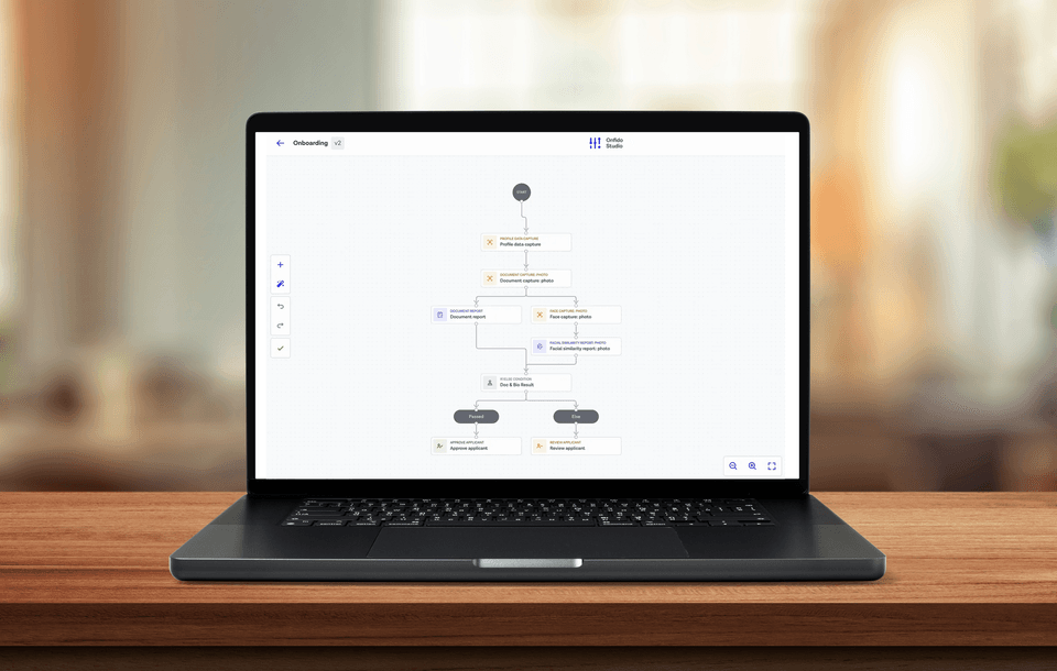
Over the past 3 years at Onfido I’ve been involved in multiple product launches, watching their development from an idea to an MVP, to a product serving hundreds of customers and millions of users.
Throughout the journey, very limited resources were available online, so I decided to share my own experience here.
Product Discovery
At Onfido, we use AI to automate digital identity verification for thousands of businesses worldwide. Our proprietary AI has been built over ten years by a dedicated team of hundreds of researchers, engineers and data scientists to make our analysis fair, fast and accurate. In our standard product, the verification is done using a photo of a government-issued document and matching it with facial biometrics.
We wanted to develop a new, customisable product that would fit more of our customers’ use cases and enable our customers to create their user journeys. What we wanted to achieve was a no-code product, where a customer could combine different verifications — biometric, data, fraud signals — with custom logic. This would allow our customers to trigger the right experience for every end user and respond to changing market conditions while also navigating KYC and AML compliance.
For instance, for one client receiving the same end user’s document multiple times can be a sign of fraud, while for others it can be part of their legitimate use case — reverification. A typical example of reverification is when an already onboarded user verifies themselves to make a bank transfer or recovering their account after having lost a passport. Some customers accept expired documents from specific regions. This rule can be customised using a logical condition to accommodate their requirements.
A customer can create their own verification workflow from scratch combining verification methods, configuring necessary capture steps, adding conditions and defining outcomes. A basic example of an onboarding workflow can be the following:
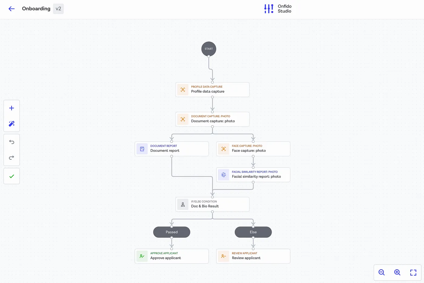
First, the user is asked to submit their personal information, including their first name, last name, and date of birth. In the next step, they upload a photo of their document, which is used for document verification. After that, they take a selfie for biometric verification. If both the document and selfie pass verification with no signs of fraud, the applicant is approved. If any issues are detected, the application is flagged for further review.
At this stage there is no data available specifically related to this product yet, however a data scientist can validate that there’s potential value by aiding market research. Could this product fill any potential gaps in the market? Could it solve some customer pain points? Does it have potential to bring value?
We can run different simulations on existing customer data and see how adopting Studio impacts the main metrics. We can estimate how many more users can succeed the verification if we allow expired documents from certain geographies. We can calculate the average time we save for the end user if we introduce a parallel verification execution.
Data Strategy
Measuring Success
Defining metrics before a product launch is crucial for ensuring the success and scalability of the product. Metrics serve as a guiding framework to measure performance, track goals, and make informed decisions from day one.
While many frameworks are available, we found that none offered an out-of-the-box solution for a highly customisable B2B product. As a result, we adapted some metrics from our standard product and developed new ones to track adoption and other product-specific aspects.
High level:
- Usage — e.g. the number of daily users
- Outcomes — e.g. the number of successful verifications, the number of fraudsters caught
Adoption:
- The number of clients using the product
- The number of workflows per client
Product stability:
- Drop off — e.g. the number of users not completing the workflow
- Flow duration — e.g. the median time it takes to complete the workflow
- Error rate — e.g. the percentage of workflows that have errors
Efficient Data Model
To track these metrics, the data has to be structured in a way that facilitates efficient storage, retrieval, and analysis. We started from an event-based raw data which was a product requirement. The goal was to create a pivotable, aggregated and insightful data model from these events, that is simpler and faster for querying.
For the first iteration, we identified the necessary event payloads based on the key metrics and product sketches. We began with the minimum viable requirements while ensuring the design remains scalable as the product evolves. We established the key entities and their relationships:
- User (user_id, client_id)
- Workflow (workflow_id, client_id, node_id)
- Event (event_id, user_id, event_type, workflow_id, node_id, timestamp)
An Event is associated with a User and a Workflow.
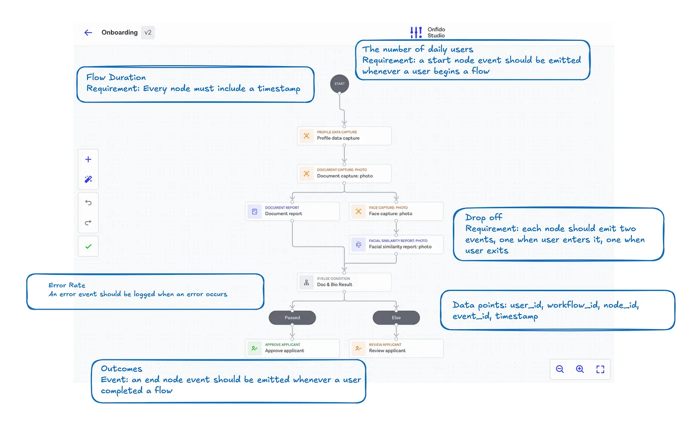
We could’ve stored everything in one event table and for some use cases that would be enough. For instance, to calculate the number of document captures or to calculate how often the customers are using logical conditions.
However, often the questions we’re interested in are more complicated than that. How many users with a French ID have fraudulent selfies? To calculate this, we need to have the result of document classification from the document report node, and we need to combine that with the facial similarity report result. To recap the computational steps needed:
- Group events by users
- For each user, identify their document type
- For each user, identify facial similarity report result
- Aggregate users who have a French ID and fraudulent facial similarity report result
When working with event data, our primary goal is to analyse user journeys, which consist of sequences of events. To do this effectively, we need to aggregate events within these journeys to create structured representations — at a workflow level or user level — which serve as higher-order units of analysis.
We defined tables based on the identified levels of granularity:
- Raw events table — the source table with raw events emitted by the Studio service.
| Event ID | User ID | Event Type | Workflow ID | Node ID | Timestamp |
|---|
- Aggregated workflow table:
| Workflow ID | Client ID | User ID | Result | Duration | Workflow Start Time | Workflow End Time | Document Type | Document Report Result | Bio Report Result |
|---|
The workflow table aggregates the event-level data down to an individual workflow level, where an example workflow starts with a user submitting their personal information and ends with either approval or review. The aggregated table contains information on the overall result as well as different verification results, and when the workflow started, when it was completed, and what duration it had.
This modelled data is easy to work with. We can easily answer the question above with the following query:
SELECT COUNT(workflow_id)
FROM workflow_table
WHERE document_type = 'FRA_ID'
AND result = 'Abandoned'
This table is also of lower volume (contains fewer rows) than the raw event one, so it’s faster to query. While the raw events are typically immutable, the modelled data can change depending on business logic, resulting in adding more columns or modifying the existing ones.
Observability
Creating the first dashboard before a product launch was crucial for several reasons:
- Building a dashboard sometimes reveals overlooked details — such as missing event properties or gaps in the data model that make certain metrics difficult to track (a special mention to our favourite challenge: symmetric aggregates with percentiles).
- Having a dashboard allows tracking key metrics from day one. It ensures that there’s a baseline we can measure our performance against.
- Without dashboards, detecting and diagnosing issues can take longer. With proper monitoring in place, we can quickly spot bugs, performance bottlenecks and other unexpected behaviour during the testing phase.
- Dashboards give stakeholders — product managers, engineers, leaders — immediate visibility into product performance.
- Finally, dashboards offer real-time insights into user behaviour, engagement, and adoption. This allows for data-driven adjustments to the product, marketing strategies, and onboarding processes based on actual usage patterns.
We kicked off with a team exercise to translate product requirements and key metrics into a dashboard sketch. We began by listing the questions we wanted to answer and identifying the necessary metrics, grouping them into categories such as high-level outcomes, product performance, and user behaviour.
Next, we sketched out the top-priority metrics, selecting the most suitable chart types for each. We also considered filters and interactivity — ensuring we can later refine data by date, region, SDK type, and other relevant factors. This sketching process helped us quickly align on expectations and avoid unnecessary revisions later.
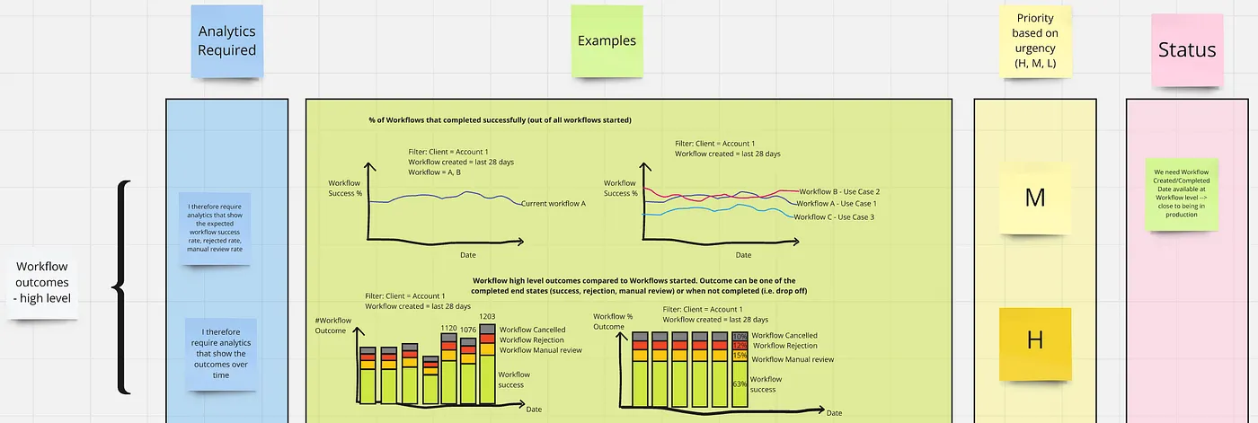
It also helped us discover missing event payloads and necessary changes to the data model.
First Beta Clients
As we finished the internal testing phase, we started offering Studio in beta to the first customers. Two good data science practices at this stage are:
- Choosing the Minimum Viable Audience wisely — these first clients were the ones who can benefit from Studio the most, the ones that needed the flexibility of creating custom workflows.
- Gradual Rollout allows fixing unexpected issues before they affect a lot of users. Another benefit is that simulations often don’t reflect real performance of the system; gradual rollout helps test the system under actual conditions, ensuring performance stability.
The main challenge, however, wasn’t related to data science — it was ensuring we had enough table stake features to get customers adopting it. Moreover, we discovered that due to different sources for customer data we couldn’t properly track who’s interested in adopting Studio and anticipate the increasing volumes.
Having dashboards provided great quantitative insights into different workflows our customers created for their use cases, however having their direct feedback was crucial. It highlighted gaps in our monitoring that we hadn’t initially considered. For example, we weren’t tracking how often customers modified their workflows, which often had an impact on SDK versions and overall outcomes.
We initially provided customers with a basic dashboard, but we quickly realised it likely won’t be sufficient for them to dive deeper into the reasons behind metrics.
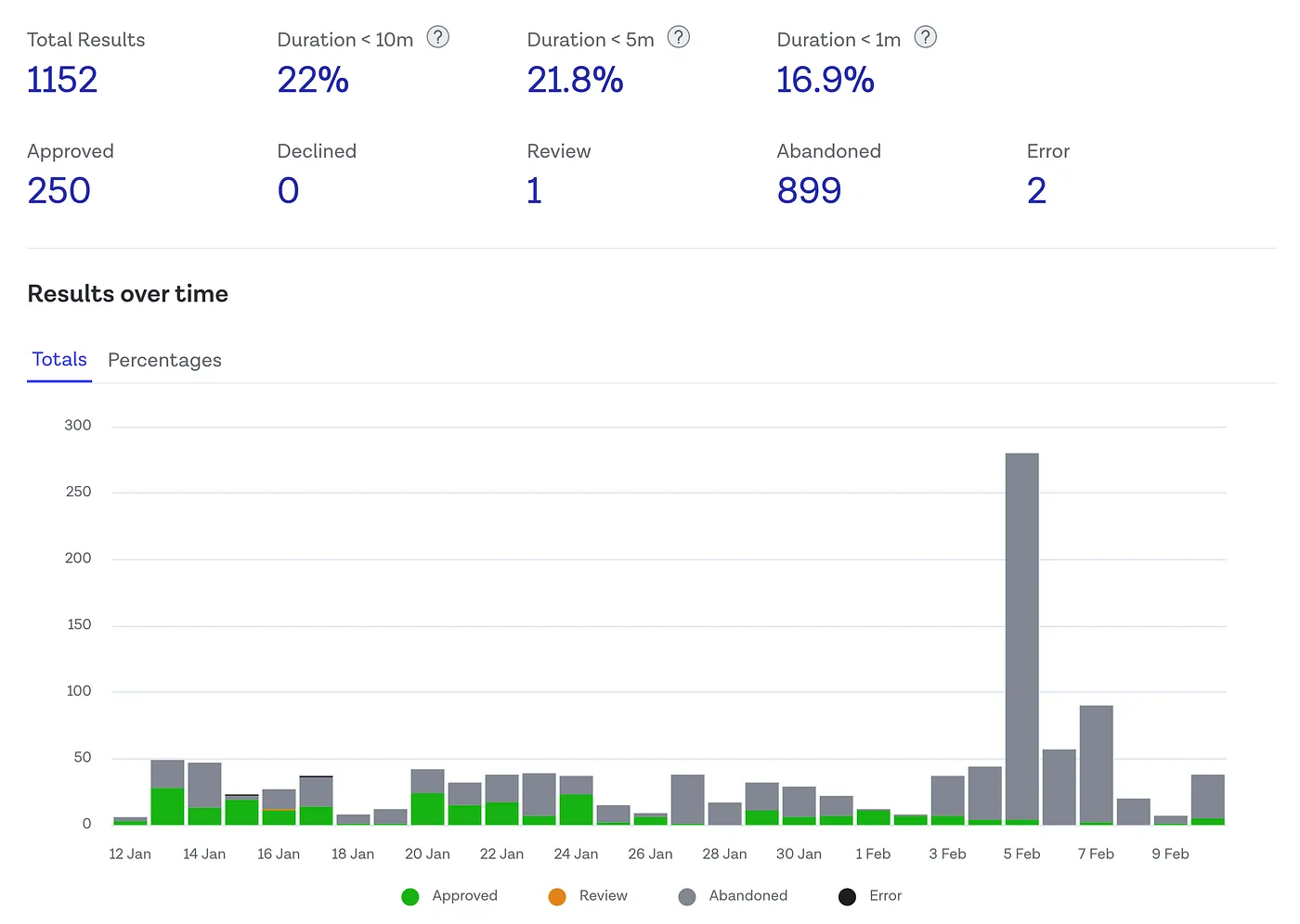
For example, customers wanted the ability to investigate whether users abandoning verification was linked to specific devices, SDK versions, or regions to improve their performance.
A highly customisable product requires providing customers with detailed insights as they navigate translating their use cases to workflows. They need the ability to optimise and fine-tune their workflows. This was the challenge we set out to solve for general availability release.

Hook this up to your favourite commenting platform — Giscus, Disqus, or your own.
Continue reading

Co-Developing Products: A Deep Dive Into Customer Insights
Co-development means companies create products with their customers and users. Explore the benefits and three layers of customer insight.

Causal Inference at Onfido
How Onfido's data science team built a Structural Causal Model of their document verification pipeline — and used it to simulate the impact of product improvements before shipping a single line of new code.

Remote Design Sprint: Learnings from Facilitating
Tales from a designer running his first remote design sprint — what preparation actually means, how to stay adaptable when things go sideways, and why team dynamics matter more than any template.